Hello lovelies,
These are coming nice and steady. I can’t believe this is the 90th!
If you have read any of these before I suggest you skip everything and just go straight to the photo’s. If you’re new to the blog or haven’t seen these yet then I suggest you go take a look at Tuesday Stamping #1. I explain most of it there but will I also give a brief run down in this post. So if you’ve read it, scroll over the first bit of text 😉
Basically, this is how I am going to do it. I am going to be stamping over black and white. White will be the lightest colour you ever wear and black the darkest. What better way to see how a polish works over dark and light colours. Now, obviously, not many will actually want to stamp OVER black but it will be a good way to find out if a polish will show up over dark colours. If it shows up on black you can be pretty certain it will show up over everything. That does mean that if it is noticeable but not very, it will probably work much better over say a purple or a blue. I will try to address this with each polish I show you as well.
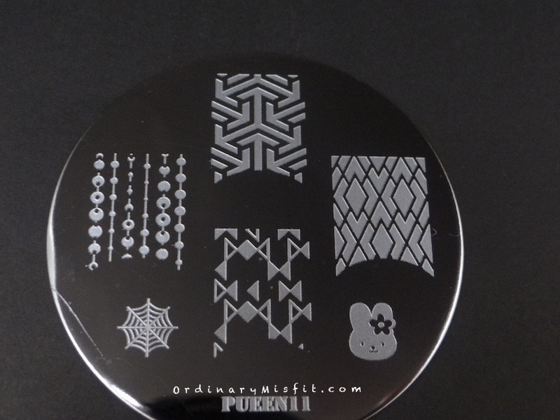
I will also be using the same plate for all the stamping to make sure there will be continuity. I chose a stamp that had some images with thin lines, with bigger spaces, with some detail etc. That way you can see if a polish will stamp crisp lines when they are thin or if it will smudge when the image has bigger spaces. I decided to go with Pueen11. I will be using the 4 full nail images on this plate.
I will show you 4 of my ordinary polishes with every post. If you want to see more or less per post please let me know. I will use 4 random polishes each time until I have worked through all the polishes I have (excluding glitters of course) and I will show you everything, whether it stamped well or not. I will also be showing you my first attempts at all of them. Sometimes it happens that you move the stamper a little bit when you stamp onto the nail. Or you waited just a second too long and the whole image doesn’t transfer. Or you press too hard and get the shadow stamping. Usually if this happens I would remove it and stamp again. It also happens that a polish looks so promising and after you’ve stamped you think, ah this could look better if I tried it once or twice more. I will not be doing any of that. What I stamp first try is what you get. I just feel that you can get a better result if you keep trying but the mark of a good stamping polish is how well it works straight off the bat.
To see all the Tuesday Stamping posts you can use the Tuesday Stamping tag in the tag cloud or you can go to the Swatches tab in the top menu and look under Stamping swatches. These are sorted by brand, then name alphabetically.
***
Today I decided to test 4 Dollish Polish polishes. I often disregard indie type polishes because I always assume that with the glitter they won’t stamp well. I do however have some holo’s too so I randomly grabbed 4. Let’s see how it goes.
Dollish polish – Curse your sudden but inevitable betrayal
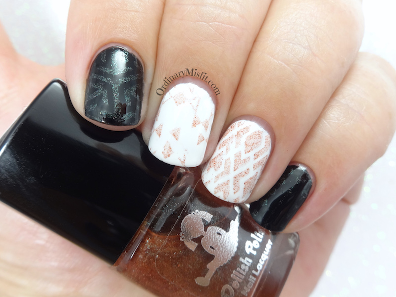
I didn’t expect much when I grabbed this one but it didn’t do as badly as I expected. It is visible on the white but doesn’t show much. On the black the shimmer does a great job of standing out. It does show the green shift in the polish too. I like how it looks on the black but it doesn’t blow me away.
Dollish polish – Frakkin’ toasters
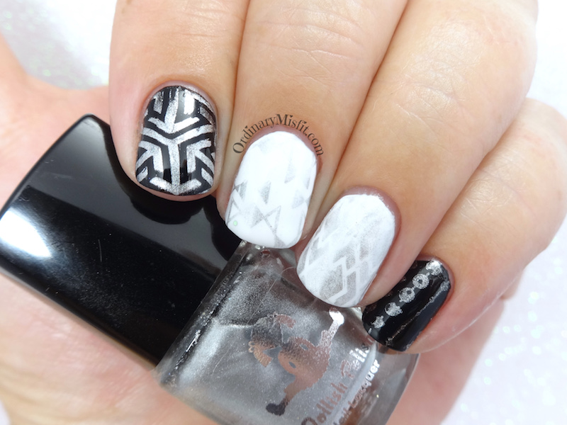
Now this is more like it. It does show up on the white but is very washed out because of the lack of contrast. It shows up beautifully on the black though. In the sun the holo also performs well. Definitely an option for darker colours.
Dollish polish – Nice F*cking model!
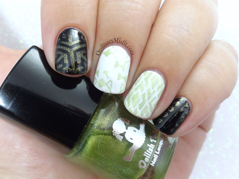
I am surprised by how much I liked this. It shows up on the white and even tough it isn’t super opaque or crisp on the white the shimmer really does make it look nice. On the black the green is a little more visible and again the shimmer performs really well. I like this.
Dollish polish – The angels have the phonebox
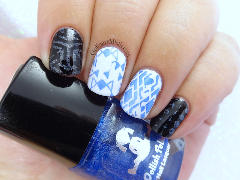
I did expect this one to do better than others and I wasn’t wrong. It shows up well on the white – any gaps not he stamping on my ring finger is completely my fault – and you can see the beautiful blue colour. It also looks good on the black. The bonus is the holo that didn’t show up much in my lightbox but it does look beautiful on the black, The white doesn’t help the holo but it’s there.
What do you think? None of them completely blew me away but Frakkin’ toasters and The angels have the phonebox seems to have done better than the others. Which is your favourite? Do you want to see any of them stamped over a specific colour? Do you have an idea for a stamped design you would like me to do? Do you have any suggestions for changes or additions you would prefer on these posts? I would love to hear from you. Or if you want to choose the next 4 polishes let me know.
Thanks for reading,


