Hello lovelies,
Good morning! Did you have a good weekend? Mine wasn’t too bad. I was nice and productive but also had some down time. What did you get up to? This month seems to be flying a bit. We have our secret Santa exchange in a few weeks and I am so excited!!
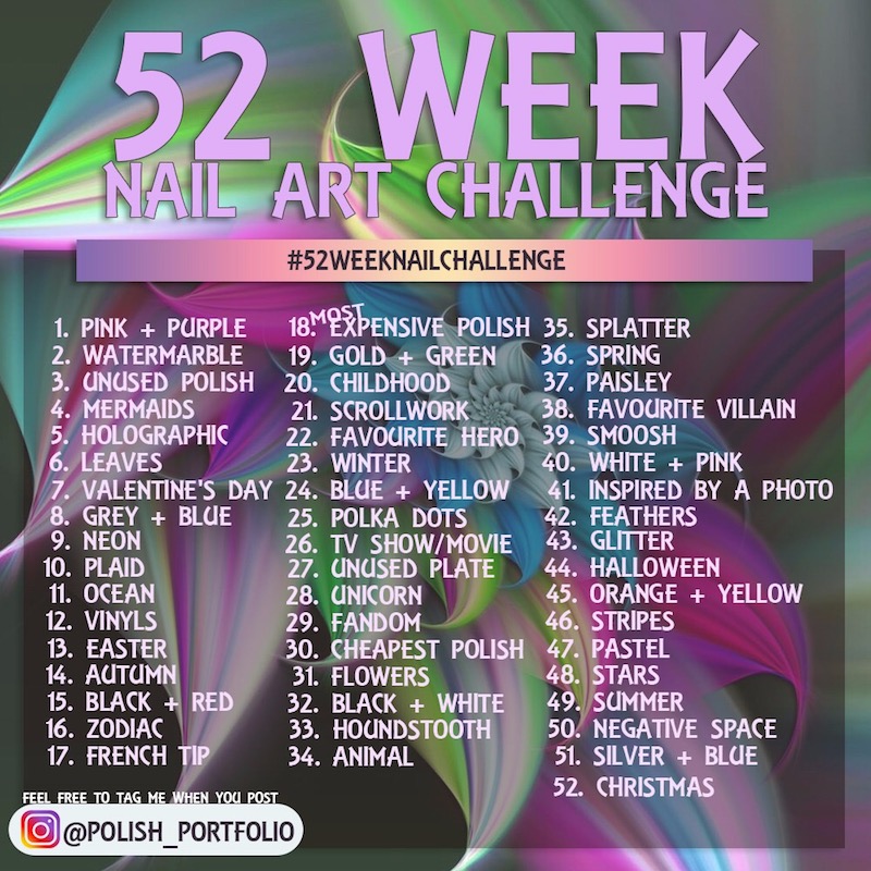
Time for another week of #52weeknailchallenge hosted by Polish Portfolio. As always, you can follow this # to see what other people are creating and you can find the list of prompts for this year below.
The prompt this week is inspired by a photo and I had endless option to choose from. I posted a photo in our secret Santa group a few months ago of a wall in our gym and I mentioned how it is such an interesting pattern and it makes me want to do nail art. Roll on this prompt and Juanita suggested that we use that photo for this prompt. I know not everyone is using it but a few of them are so let me show you the photo.
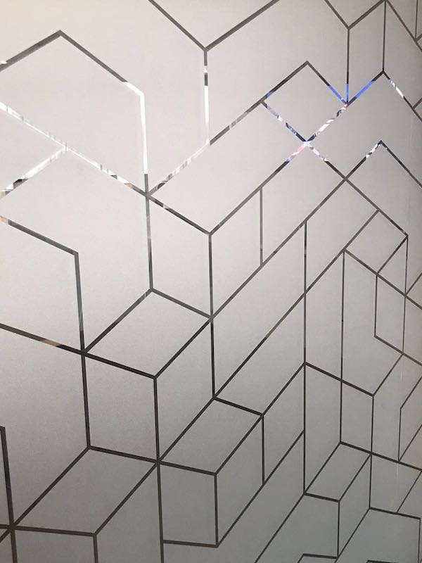
This is a frosted glass wall with this gorgeous pattern on it. Two things that struck me when I looked at it is that the clear pattern actually gradients in colour (obviously based on whatever is behind it and the angle you look at it) and that the frosted part looks a little bit grey, a little bit off white, a little bit nude. I was excited to see how I could do this in nail art. Let me show you what I did.
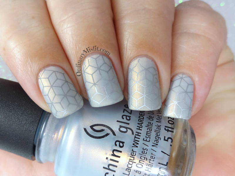
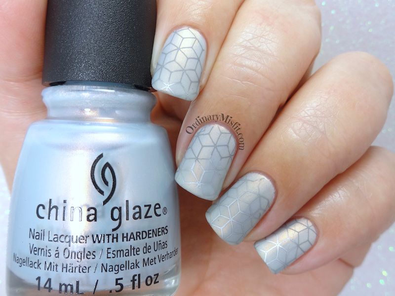
I played around with colours and started with 1 coat of China Glaze – Snow way and then 1 coat of China Glaze – Pearl jamming’. Once it was completely dry I stamped using Lina – Feeling shapely 09 and a gradient of Mundo de Unas – Light gray and Mundo de Unas – Silver. I topcoated and once it was dry I used a matte topcoat.
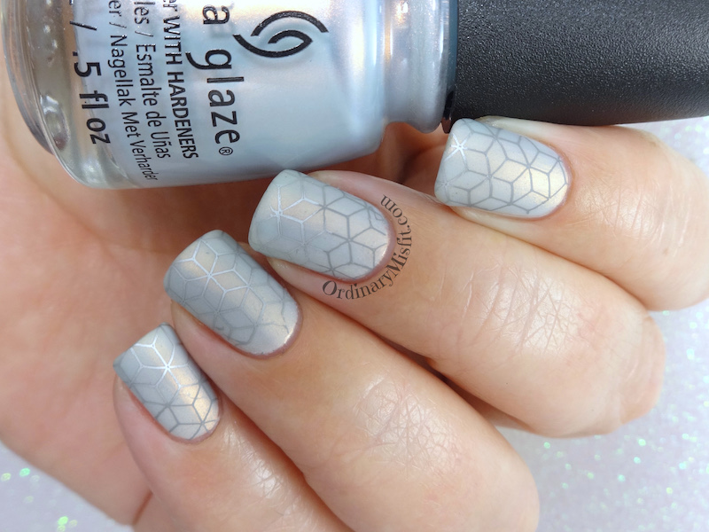
I layered those polishes as a base because Snow way was a little too white and Pearl jammin’ was a little too blue/ grey but when I layered them I got a nice mix of both. The shimmer in pearl jammin’ also helped with that slight nude look I got from the photo. I don’t know if it did the photo any justice but I liked it anyway. What do you think? I really liked the gradient stamping as it gave it that light and shadow I got from the photo.
Thanks for reading,


Stunning!
Thank you!
These look stunning! You’re making me want to grab out that CG ?
Ah thank you so much Tracy. I always underestimate this polish and then I use it and love it all over again.
This captures the picture perfectly!
I have to admit I like the parts closest to your cuticle best as I LOVE the darker gray with the base, but I can totally see why you did the gradient stamping 🙂
I think I agree with you about the darker grey stamping. I like that it portrayed the changing light behind the lines of the photo but I do think the darker grey works much better. Thanks so much Joyce.