Hello lovelies,
I hope you had a spectacular weekend. Mine was just the right amount of busy. I am a little blown away that we are already 45 weeks into the year (that means 7 left) and it won’t be long now before everyone is in the holiday spirit. Also, I’ve decided to add some nail polish and nail art goodies to my shop and it has me SO excited. I am just so in love with polish that it seemed natural. I will be updating the pic with the link on the side there so that it shows the polish and not just the clothes 😉
Time for another week of #52weeknailchallenge hosted by Polish Portfolio. As always, you can follow this # to see what other people are creating and you can find the list of prompts for this year below.

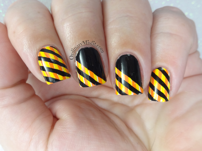
The prompt this week is orange and yellow and I was a little unsure at first. It’s not a colour combination I have used very often but it isn’t altogether an unpleasant combo. I stumbled across this idea accidentally while I was looking for a different idea for a completely different prompt. Let me show you what I did,


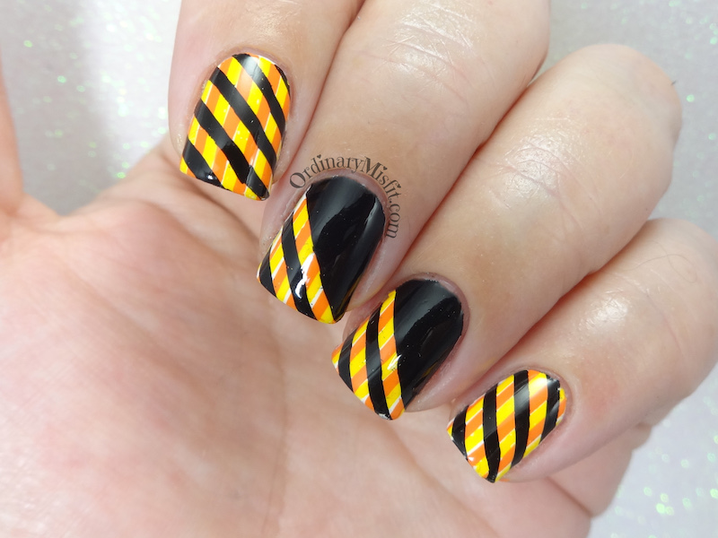
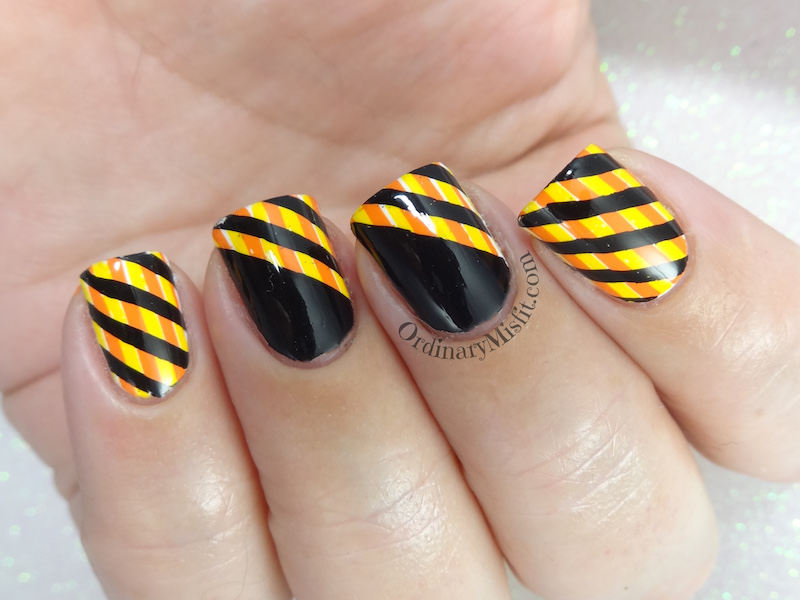
I started with 1 coat of Sinful Colors – Snow me white on all my nails and left that to dry a little. I then got to work with some stamping. I stamped the vertical lines using Lina – Feeling Shapely 01 and Mundo de Unas – Yellow, I then stamped the same using Mundo de Unas – Geranium. Once that was dry I grabbed the plate again and stamped the black. I used the diagonal stripes using Lina – Feeling shapely 01 and Mundo de Unas – Black. On my middle and ring finger I left a section of it with the stripes and then stamped the stripes again on the other section so that the black was solid. I topcoated and that was that.

I wish did a better job of stamping the yellow and orange stripes. On my middle and ring finger I see slivers of the white base peeking out. I really really liked the yellow and orange combination of the stripes and I loved it with the black. What do you think? Does this work for the prompt? Is it too much? I wasn’t sure if I should keep this for next weeks prompt (stripes) or stick to the orange and yellow that I love so much. Who knows maybe you will see this again with different colours. 😉
Thanks for reading,


Love it!!! It looks like a sophisticated bumble bee 🙂
Maybe you could try stamping the orange (=darker) stripes over a yellow base? That way you don’t have to worry about the white base peeking through.
Joyce recently posted…Art deco in fall colors
You know….sometimes you will say something that makes me realise what a dummy I am. I have NO idea why I didn’t just stamp the orange on the yellow. No idea at all. Because that seems so logical and simple when you say it. oh gosh. I do like the sophisticated bumblebee though! I’ll take it!